Times New Roman is Dead.
 Typography is changing once again.
I was compelled to write this post because of a certain organization that has gotten on my nerves: the MLA. The MLA is basically an association that promotes uniform standards, and my English teacher and the rest of my school, city, and state follow it.
With my OCD, I would normally tolerate it. But one thing about them bothers me a ton: Times New Roman.
 The institution requires all papers written in their format to use Times New Roman. All.
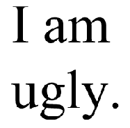
All papers must use an ugly 80-year-old font.
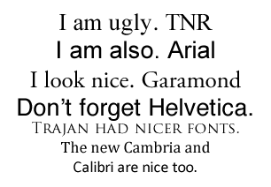
This font and Arial aggravate me a ton. Why? They just don't look good.
Microsoft had attempted to make a change by switching over to Cambria and Calibri in 2006, but I don't believe we will see results until organizations like the MLA decide to change their fonts.
Most graphics today don't use Arial or TNR. In books, Garamond is typically used. The Harry Potter series for example, uses this awesome font made in the 1500's. Segoe UI was on the front of a magazine cover a while back. Papyrus was used (such an overused font though!) on the Avatar logo. But I have never seen Times New Roman or Arial embraced on any sort of thing other than papers and stuff older than the 1980's. The fonts just look cheap and ugly.
Organizations like Microsoft and Apple I applaud for their support in changing fonts. But things like OpenOffice, the W3C and Web 1.0, people who use Windows 98 (12 years is a long time in the computer world), the person who made SimSun's English font some sort of weird thing, and many more just aggravate me in addition to the MLA.
I know this blog post is all over the place, but people really need to change their standard fonts. End of rant.
Thanks for reading my post! If you enjoyed it or it helped you, please consider liking/tweeting this page, commenting, or following me on GitHub or Twitter!