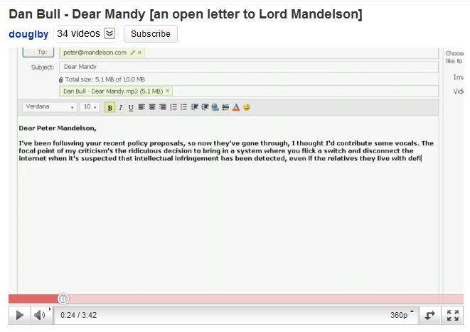
Youtube Rolls Out All-New Video Player
 It seems like it was just yesterday that Youtube had a new video player out. True -- in late January the Youtube page was redesigned again. Today, April 28, Youtube unveiled its newest video player, taking a more streamlined approach to viewing videos.
The player makes many aesthetic changes to the current player.
 The bottom "seek" bar is moved above the controls and can be hidden when the mouse is moved off of the video player. Volume changing is available when mousing over the volume button, also doubling as a mute button. The little resolution changer looks much more sleek now. Colors are also much brighter. Less attention is wasted on the seek bar since it fades out after the mouse is removed.
 As you can see though, the bar takes up a little more space than the previous one.
The problem with this new design is that the seek bar is hard to hide. While it only takes a few seconds to hide it after moving the mouse off of the small player, in full screen, the seek bar cannot be hidden and is placed ON TOP OF the content. The bar does look sleek, but I think the older, more compact design works better.
Here's an example video (shown above) of the new player in action. (Not all videos have been upgraded yet.)
Do you like this new design?
Thanks for reading my post! If you enjoyed it or it helped you, please consider liking/tweeting this page, commenting, or following me on GitHub or Twitter!