Dontclick.it - A revolutionary way to navigate on computers
Imagine a world where mice didn't have buttons. Imagine the mouse only being able to move. Imagine that the whole internet was created for that.
Hard to imagine, eh? Well, I stumbled upon this website, Dontclick.it.
“Within this interface you wont find any buttons. Instead you navigate the contents in a different way. You will get the hang of it immediately.”
Everyday, netizens navigate through links and play buttons and forms with the mouse button(s). Without the click, things like carpal tunnel and arthritis could be reduced.
Sounds crazy, eh?
The creator of this website believed that most of the time moving the mouse between clicks is usually "dead space". Therefore, he proposed and created this website to test how people react to a clickless environment.
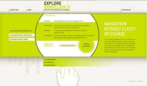
[caption id="attachment_257" align="alignright" width="300" caption="Dontclick.it's clickless interface"] [/caption]
The site's navigation is very unique. Basically, you put your mouse over a page and the page opens underneath or on top, depending on what page you're looking at. The site contains information on how this feat could be accomplished, such as examples on "clicking" buttons without clicking and even a contact form.
It's better not to click, anyways, from what I read on the ergonomics page. A click takes longer for the brain to process than a mouseover, apparently. Recent studies show that a bad interface can cause stress and heart problems. Also, without clicks, you will only use hands for typing; the rest is all arm.
Maybe it's not as outlandish as it seems.
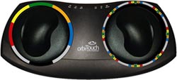
[caption id="attachment_258" align="alignleft" width="250" caption="Weird Orb Keyboard"] [/caption]
This orb keyboard was developed for a similar reason (yes, keyboard) and was built for aliens. (No, just kidding, but how are you actually supposed to type on this thing?) You slide around the orbs to choose letters.
This also doubles as a mouse, so you do have to click. Nevertheless, it eliminates harmful key strokes that can cause carpal tunnel and arthritis. It may seem weird at first, but who knows?
Anyways, the cool navigation entices you to explore the whole site. A lot of the parts look like buttons, so if you accidentally forget and click on the site, you must input if your click was either accidental or intentional. After that, the site asks if you like not having to click. I personally feel uncomfortable, but that's just me.
The website is not only for entertainment but for research too.
Who knows, one day we might all end up rolling a little ball around a table to navigate. In my opinion, we'll have some sort of a multitouch pad like the Apple Magic Mouse and use that to navigate around Web 4.0. One thing is for sure, though: we'll have to get rid of the whole existing infrastructure and it may take up to 200 years from now to do so.
Thanks for reading my post! If you enjoyed it or it helped you, please consider liking/tweeting this page, commenting, or following me on GitHub or Twitter!